47 Percent Myth Revisited
I've heard a lot about this supposed dichotomy between takers and payers in the United States, usually with an implicit or explicit assumption about how the "two halves" vote. But I haven't seen any reference to data that suggests in detail whether it's in fact true that the recipients of federal tax largess principally vote for Democrats. I suspect it isn't, especially if you include all federal spending and not just entitlements.
Reliably Republican enclaves such as Wyoming, South Carolina, Alaska, Texas etc. are among the largest per capita recipients of federal money; if people were truly voting in favor of the spigot faced their way, you might expect to see them turn away from those making the most noise about radically slashing the budget.
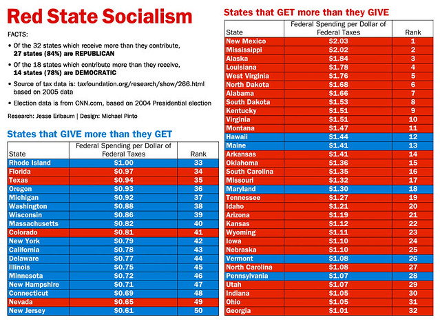 Here's a great graphic about voting and spending patterns, with federal spending aggregated:
If you exclude all non-entitlement spending, I'm still not convinced (due to the complete lack of compelling data in columns like these) that entitlement recipients vote by large margins for Democrats. It might be true, but you'd never know it reading (for example) the final column on Campaign Stops , a blog at the NY Times- despite its apparent dedication to discussing the issue in detail, no actual data on the correlation between recipient status and voting patterns is given.
 If it were true that there was a strong connection between government spending and voting patterns, you might expect that it would hold true for spending at the state level. The anti-government arguments, often framed in terms of "small government is good government" (a principle I don't disagree with, I should say), isn't limited to the federal government. So I would anticipate that, for instance, government spending would be the most constrained and grow at the slowest rate in states that voted most heavily for Romney in the recent elections. But this big government / pro-Obama positive correlation doesn't actually exist, and in fact the opposite appears to be true to the extent any relationship exists at all. Take a look:
Of the five states with the highest 10 year growth rate in government spending, 3 voted overwhelmingly for Mitt Romney in 2012. Wyoming, with 61% budget growth from 2000 to 2010, voted for Romney by a margin over 40%. The top five states, in order and with their red/blue status:
1) Oklahoma (R), 74%
2) Louisiana (R), 64%
3) New Jersey (B), 62%
4) Wyoming (R), 61%
5) Illinois (B). 57%
While Wyoming and Oklahoma voted for Romney in margins larger than anywhere else in the U.S., Illinois and New Jersey were comparatively modest wins for Obama - particularly in Illinois, where Obama won with 57% of the vote, less than you might expect for an incumbent Illinois native.
Despite what the pundits might argue, there doesn't appear to be strong data to suggest that Romney's 47% theory is useful in predicting actual voting patterns. That's to say nothing of its underlying assumption, the oft-quoted yet never proven trope that 47% of Americans live a tax free life. For more on that, see my July 2011 post "Tropes and truths about true tax rates".
Reliably Republican enclaves such as Wyoming, South Carolina, Alaska, Texas etc. are among the largest per capita recipients of federal money; if people were truly voting in favor of the spigot faced their way, you might expect to see them turn away from those making the most noise about radically slashing the budget.
If you exclude all non-entitlement spending, I'm still not convinced (due to the complete lack of compelling data in columns like these) that entitlement recipients vote by large margins for Democrats. It might be true, but you'd never know it reading (for example) the final column on Campaign Stops , a blog at the NY Times- despite its apparent dedication to discussing the issue in detail, no actual data on the correlation between recipient status and voting patterns is given.
If it were true that there was a strong connection between government spending and voting patterns, you might expect that it would hold true for spending at the state level. The anti-government arguments, often framed in terms of "small government is good government" (a principle I don't disagree with, I should say), isn't limited to the federal government. So I would anticipate that, for instance, government spending would be the most constrained and grow at the slowest rate in states that voted most heavily for Romney in the recent elections. But this big government / pro-Obama positive correlation doesn't actually exist, and in fact the opposite appears to be true to the extent any relationship exists at all. Take a look:Of the five states with the highest 10 year growth rate in government spending, 3 voted overwhelmingly for Mitt Romney in 2012. Wyoming, with 61% budget growth from 2000 to 2010, voted for Romney by a margin over 40%. The top five states, in order and with their red/blue status:
1) Oklahoma (R), 74%
2) Louisiana (R), 64%
3) New Jersey (B), 62%
4) Wyoming (R), 61%
5) Illinois (B). 57%
While Wyoming and Oklahoma voted for Romney in margins larger than anywhere else in the U.S., Illinois and New Jersey were comparatively modest wins for Obama - particularly in Illinois, where Obama won with 57% of the vote, less than you might expect for an incumbent Illinois native.
Despite what the pundits might argue, there doesn't appear to be strong data to suggest that Romney's 47% theory is useful in predicting actual voting patterns. That's to say nothing of its underlying assumption, the oft-quoted yet never proven trope that 47% of Americans live a tax free life. For more on that, see my July 2011 post "Tropes and truths about true tax rates".


The King Casino | Situs Judi Slot Online Terbaik 2021
ReplyDeletePlay online worrione.com Pragmatic Play https://tricktactoe.com/ Slots at https://septcasino.com/review/merit-casino/ The https://vannienailor4166blog.blogspot.com/ King Casino - Member Baru & Terpercaya 2021! Rating: 98% · 240,388 1xbet login votes